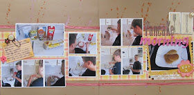
I think everyone has a colour nemesis. Two of mine are pink and yellow. Yellow...I just don't care for a whole lot. Pink... well, I've talked before about how a male dominated household means scrapping with pink is not a regular occurrence. So I really surprised myself with this next LO for the November challenge at Scrap Our Stash. I pulled out this plaid paper by Cosmo Cricket. The yellow and pink reminded me so of a cozy morning. It became the basis for the design behind Pancake Morning.
While there is nothing wrong with pancakes from a box, it's really not hard to just make your own mix. My son loves helping me and so, when the challenge to scrap a family recipe was issued, it was the perfect excuse to make pancakes for breakfast. I should do this more often. I guess I am just more of a " let's have cereal" type of mom. Anyway, to make your own pancakes " not from a box", try this recipe"
Ingredients:
1 1/4 cups flour, 1/4 cup of sugar (yes I know it's a lot of sugar. We like em' sweet. You can reduce the sugar if you want to), 1 Tbsp. baking powder, 1 egg, 1 cup milk, 2 Tbsp. vegetable oil
- stir dry ingredients together - in a separate bowl, mix egg milk and oil, then mix with dry ingredients - spoon onto a heated pan, allow to bubble, then flip and cook until golden brown
It's such an easy recipe! It makes a lot more than we can eat. So I proportion the leftover pancakes into zip loc bags and freeze. I then have my own toaster pancakes!
To make the page more quickly, I left the white edges from the photo paper. The smaller photos are all one sheet of wallet size photos, three to a row. Some of them printed in groups with the photos in those rows aligning the same direction. I kept one group of three and simply cropped away the excess white. I cut the two photos which were horizontal and left the vertical photos in groups of two. This allowed me to save time (and supplies) by having photos that were already matted and easy to place on the page.
I don't have a lot of cooking themed embellishments in my stash. I had a Eureka moment when I discovered food themed embellishments in my travel supplies. Prior to this page, I might never have thought to look in my travel stash for such a thing. I noticed many of the travel themed collections had papers or items about places you had eaten. So next time I have a cooking themed page, I will also look to the travel themed papers.
I am very happy with the title. Glossy accents is one of my go to adhesives. It allowed me to add dimension to the flat brown letters. Now they look more like epoxy letters and I was able to add some glass beads to add more texture.
This year, my goal was to learn how to take better photos of my pages. I am best at photographing one page LO's. Two pagers are very difficult given that they often have a warped or bent look to them. With this two pager, I think I finally found a trick to reduce the warped look and get a more flat, even photo. I placed the LO on a travel trunk which reached to my knees. I was then able to bend over the photo and I found that if I cocked my wrist as I photographed the page, the page came out more flat as I cropped in afterwards. So try finding something to lay your page on that is about the height of your knees and experiment with moving the angle of your wrist.
Overall, I really enjoyed making this page...from staging a photo shoot with a pancake breakfast, to adding the finishing touches on the page. Yes, it's true...I staged the photos.
So now it's your turn. Find a recipe you like and stage your own photos to make a wonderful LO. Don't forget to submit it here at Scrap Our Stash.
Now it's your turn to take the November Recipe Challenge. You have two choices.
Follow this recipe:
5 embelishments (flowers, buttons, etc)
4 words or letters in your title
3 pictures
2 pattern papers
1 solid paper
or
You can do a layout containing a recipe - maybe one of your family's favorite Thanksgiving dish or a family recipe.
To participate in the November Recipe Challenge - just complete a project using one of the challenges mentioned above and email a picture of your project along with a description to Scrappinpsycho@live.com All submissions will be posted to The Scrap Our Stash blog and on November 30th a winner will be chosen, and given the opportunity to be a Guest Design Team Member for the month of January. This challenge ends at midnight central time on November 30th.


Great layout! I like the border on the pictures and that you even have pics of the knife and fork! It add variety to the layout.
ReplyDeleteGreat layout. I love all the paint splatters and you did a good job getting a ton of photos on one layout!
ReplyDeleteGreat layout. Love how you got so many photos on there!
ReplyDeleteAwesome layout girl! I really like the beads in the glossy accents. Those pancakes look yummy! Ha
ReplyDeleteYummy...my son is a pancake lover...I'll have to try your recipe! Great layout!!
ReplyDeleteWow, what a great layout! Love all the details you put into this two page spread. Wonderful that you got so many photos into your pages!
ReplyDeleteThank you for the compliments. :)
ReplyDeleteWay to go! I can't believe anyone would stage pictures for a layout :) I would never do that!
ReplyDelete