August 31, 2016

August Winners Announced!!! :)

Hello Everyone!

First of all, Thank you to everyone who played along with our August challenges!

It's time to announce our August winners!
There were so many awesome interpretations linked up for both challenges,
it makes it a really hard task to narrow down to three.
And as always, it is great seeing such diverse creative ideas!

Our Design Team has voted and here's our August
Top 3 Picks
( in order of link up)

#2 ~ Lisa M


Congratulations!!!
One of you will be contacted and invited to be our Guest Designer for the month of October! 
Please grab our new TOP 3 blinkie below so that you can BRAG on your own blog:

And now for our August RANDOMLY drawn winner…

Congratulations 

#18 Leah Burgett


You have won the following prize:

Please leave a comment below AND...email us at scrapourstash@gmail.com
with August Winner in the subject line and we will get your prize sent out to you!!!!

Here's our WINNERS blinkie below to add to your blog:
Thank you for stopping by today!  
Make sure you visit tomorrow for the reveal of our
September Book Inspired Stash Challenge
and to meet our 
September Guest Designer!

August 28, 2016

"You Are So Cute!" LO by DT Rachelle


Hello Crafters! 

Today Designer Rachelle inspires us with this beautiful layout inspired by the Sketch +3 challenge:
Rachelle said this about her layout:
"Hi there SOS friends. Rachelle here and so happy to share my design inspiration using the awesome sketch.
I went with a clean and simple style, using fave colors. I started off with a clean background and added layers of paper. Olivia is all smiles on her first day of school.
I hope you have been inspired to start your creative project. Can't wait to see it. Thanks for stopping by and see ya soon!
Huggies!!!!

Stash List
*Various MFGS-3+{Simple Stories,Echo Park,Pebbles
*Washi Tape-top of LO!
*Xyron- Adhesive runner for title & filmstrip backing"

Here's the Challenge:

Visit the current challenge tab above for more information on this challenge!

Enjoy your day!

August 27, 2016

"XOX" LO by DT Aurelie Cormier

Happy Saturday!  Who's scrapping today?

Here's some inspiration by Designer Aurelie to get your mojo going! :) 
Here's what Aurelie said about her layout:
"Set on a piece of Carta Bella's Rustic Elegance patterned paper, I layered a ton of elements from the Basic Grey J'adore collection - 12X12 and 6X6 patterned papers, die-cut cardstock and transparency pieces, chipboard stickers, stickers and alphas. I also added some Tattered Angels Glimmer Glaze, a hand-stitched title using an American Crafts stitching template and some DMC floss, Queen & Co. washi tape, Stampin' Up vellum, a Prima tag, and finally random brads and a clothespin I found in my stash. See the three items from each challenge list provided? You got it - vellum, washi tape and the letter X (stitched one and on one of those brads!).

Hope you're inspired to start those layouts you've been telling yourselves you'd get to one day. And if you upload your own layout inspired by this challenge over on the SOS blog, you'll get a chance to win some sweet, scrappy loot!"

Here's the Challenge:
For more information, please click HERE

Happy Scrappin'! 

August 24, 2016

"Go Big Al!" LO by DT Renee Timmerman

It's Hump Day!

Here's an awesome layout from DT Renee to get you over the "Hump!" :) 
Renee shared this about her layout:
"This sketch has been by far my favorite thus far! I know- I say it every time but honestly- this one rocks! From the lists I chose : 3 Various Manufacturers , Washi Tape and the letter X. - I took the X and turned them to plus signs... Hope that works!  I love how I could use the Cool Kid line from Crate Paper as well as other scraps I had that matched perfectly, for this picture of my nephew! Even though they live in Boston, my sister keeps us in the loop of all their activities and makes it seem like we're right there with them. I also get the chance to scrapbook my family even when they are miles away. I'm so proud of the young man he's becoming! GO BIG AL!"

Here's the challenge:
For more information, please click HERE.

You still have time upload your layout to the side bar! :)

Can't wait to see your layouts!


August 23, 2016

"Vindax" LO by DT Asa

Hello!

Today we are sharing this beautiful layout by Designer Asa inspired by our Sketch +3 Challenge:
Asa said this about her layout
"Title: Vindax (that means Time for wine)

I shrunk the sketch a bit and used more straight lines than on the original. I wanted to use this photo and title and it suited better to do so. 
I love this black & white graphic thing, and I wanted to add just a little colour to it. 
Stash used:
1: Various Mfgs
2: Washi
3: Letter x 

Hope you´ll join us for this fun challenge!"

Hugs Åsa!

Here's the challenge:
Click HERE for more information on this challenge! 

Have a great day! 

August 22, 2016

"In the Pink" LO by DT Michelle Henderson

It's Monday! 

We hope you all had a fantastic scrappy weekend! :) 

Today, Designer Michelle is sharing her beautiful layout:
Here's what Michelle said about her layout:
"I love multi photo sketches - I always want to put more than one on a page..how else would I catch up???!
From the lists I used Various manufacturers (American Crafts,Kaisercraft,Basic Grey) for the papers; washi tape - I think the neon pink washi was just made for these photos! - and the letter X in the little XO embellie at the bottom.
Hopefully I've been able to give you a little inspiration 
You can find all the information about this challenge HERE.
 
Don't forget to get your layouts uploaded to the side bar by the 29th! :) 

August 21, 2016

"Maxim Not Impressed" LO by DT Zsoka Marko

Hello!

Here's a wonderful layout created by our designer Zsoka:
 Zsoka shared this about her layout:
"Hi there scrappy friends,

Zsoka here with you today with a new layout based on this month's sketch. It's such a pretty sketch again, don't you think?
At the time I created this layout, I just received this Simple Stories line, Sunshine and Happiness, so I really wanted to use it. With its florals I thought it would be perfect - I just fussy cut out some of these gorgeous flowers for my clusters. I also added some cute Jillibean Soup wood veneer flowers here. I mainly used the SS collection, but I also added a piece of washi tape from Freckled Fawn under my picture, then I used some Heidi Swapp chipboards too. Instead of using all the different patterned papers that are there in the sketch, I replaced some with hand stitching. I already had a lot going on on this layout so I thought this tones it down a little.
When I saw the lists first, the only thing I knew was that I was going to use the letter X ha! My son is called Maxim so this was an easy pick. Though I never actually write his name in the title! To draw attention to my X, I used all lower case letters in his name except for the X.
I hope I could inspire you in one way or the other! You still have a few days to link up your projects!
Have a great day and I'll be back next month with two new layouts XXX

List: Various manufacturers (Simple Stories, Freckled Fawn, Jillie Bean Soup, Heidi Swapp), Washi tape and Letter X."


Here's the challenge:

For more information, please click HERE

Happy Scrappin'! 

August 20, 2016

"Magic" LO by DT Carmen Cohen Henriquez

Who's Scrapping on this Scrappin' Saturday?  

Here's some beautiful inspiration from Designer Carmen to get your mojo going: 
Here's what Carmen shares with us:
"When I first saw this great sketch I was inpired to scrap this photo from my son and dil in Machu Pichu, Peru. I did cut it in 3 to adapt it to the sketch. 
I choose Vellum from products List 1. I used it as a background for angled cutted papers.
From List 2 I choose Washi Tape...lots of it in my stash!
I choose Xanadu from List 3, I thinks it's perfect for my photo. 
Also did pick some wood veneers, enamel dots andlittle stars. TFL!"

Here's the challenge:
For more information, please click HERE

Enjoy your Saturday! 

August 19, 2016

"Mini Golf Fun" By DT Sherri Caramico

Happy Friday!

Let's start off our weekend with this fabulous layout from Designer Sherri:
Sherri shared this about her layout:
"It is time for another SUPER AWESOME Sketch +3 Challenge from Scrap Our Stash! LOTS of opportunity to use the "Stuff" you've got ( and maybe make room for some new "STUFF!" )

I used the following items from my stash for the lists:
List 1 - "Various Mfgs (3) or more" :
Jilliebean Soup ( Yellow )
Cosmo Cricket ( Strip )
My Mind's Eye ( Flower )
Fancy Pants ( Orange )
List 2 - "We are Memory Keepers" ( Base )
List 3 - "Xyron" - used to adhere thin paper strips and "Fun Times to be Had" element

Mini golf is one of our favorite things to do when we vacation in Myrtle Beach, SC. These photos are from our last trip in December of 2105.

I had so much fun going through my Stash, and actually getting to use favorite papers scraps that I just couldn't part with! I love the mix of colors and patterns that I used. Mixing textures in my embellishments is one of my favorite things to do! I love the little groupings resin flowers, wooden embellies and transparent gems. 
As you can see I used the score card from our game as one of the paper elements in the layout - can you see who WON!!??

Have some fun with this sketch and play along with us this month! You’ll be happy you did!


Here's the challenge:
You will find all the information about this challenge HERE! 

Can't wait to see what you create! :) 

Have a great day! 

August 18, 2016

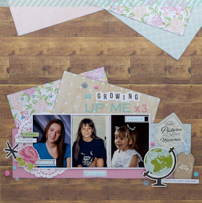
"Growing Up Me X3" LO by DT Cassie Wiscarson

Hi Friends!

Designer Cassie has created this wonderful layout inspired by the Sketch + 3 Challenge:
Here's what Cassie shares with us:
"As you can see I stayed pretty true to the sketch. After adding my patterned paper and photos I decided to move the title and not added the extra strips and labels that are at the bottom of the page in the sketch. I have had various pictures from my childhood laying around. There are no big stories behind these, so I decided to use them all on this page. As for the lists I decided to use: Various Manufacturers, Washi Tape and Letter X. I can't wait to see what you will come up with!"

Here's the challenge:
For more information, please click HERE

Have a wonderful day! 

August 17, 2016

"Capture" LO by DT Natsuko Suzuki

 Happy Hump Day!

Today, designer Natsuko is sharing her gorgeous layout she created inspired by the
Sketch +3 Challenge:
Here's what Natsuko said about her layout:
"I chose List1-Various Mfgs (Webster's Pages, Echo Park, Pink Fresh Studio, Heidi Swapp, Simple Stories), List2-Washi Tape, List3-Letter X< Instead of using 3 pictures, I used a die-cut (for a journal) and a frame on both sides of one picture. I wanted to make a summer layout, bright and fun. I love this expression of my daughter, she's always active and running around having fun.You can see more details in my blog;
Here's the challenge:
For more information, please click HERE

See you back here tomorrow with more inspiration! 

August 16, 2016

"C'mon...Smile" LO by DT Steffanie Seiler

Hello!

Today we have a beautiful layout to share with you.  It's inspired by the Sketch +3 challenge and created by our designer Steffanie Seiler:
Here's what Steffanie shares with us about her layout: 
"What a fun sketch! I have angled papers behind my photos before but I can't say that I have really ever done it the way Brenda designed for this sketch---as more of a trim or edge treatment. This is a great way to use some scraps and bring more color and different patterns to your page. I made only slight variations to the design, as you can see. For the list challenge I used (1) 3+ different manufacturers, (2) washi tape, (3) my Xyron adhesive to attach the word "smile!".
I hope you will dip into your stash and play along with this fun sketch! Be sure to link up!

Here's the challenge:

For more information, please click HERE

Happy Scrappin'! 

August 15, 2016

August Sketch +3 Challenge Reveal - Guest Designer Devra Hunt

Happy Monday!

What a great way to start of our week!  Here's the 
August Sketch +3 Sketch Challenge!
The Challenge:
Create a layout inspired by the sketch above and 
YOU MUST choose at least one item from each list.
Example: Vellum, Washi Tape, Letter X

NOTE: 
For the letter X, it must be an actual alpha embellishment 
( example: Thicker, Sticker Alpha, etc)
 words in handwritten or typewritten journaling will not count.

Mix it up anyway you want as long as you have at least (1) item from each row.
When posting your layout, you must include in your write up what items you used,
to be considered for the random prize drawing.

Click HERE for SOS Challenge Guidelines

Entries are due: August 29th, 11:59 PM (PST)

Here's the prize you are playing for this month:
This beautiful fun layout we are sharing with you today was
inspired by the challenge, and created by our
August Guest Designer
Devra Hunt

"-14-"
Devra shared this with us about her layout:
"This is a really fun sketch and something so different! When I saw the top of the sketch I immediately thought of banners. That led me to photos from my son's birthday last month. The angles in the sketch combined with my papers made for a bright whimsical page. I used Vellum layered under the banner as well as Various manufacturers, Doodlebug (paper and vellum) My Minds Eye and Freckled Fawn (enamel dots) Fancy Pants and A Flair for Buttons (Flair). Pieces of Washi Tape are at the top of the page and lastly I ran the Velum piece through my Xyron. 

blog link: My Creative View"

Now it's your turn!
Make sure you upload your layout on the side bar before August 29th! 

Have a great weekend!

August 14, 2016

"Love This Fun" Layout by DT Rachelle Olaridge

Hi there!
Today SOS Designer Rachelle is sharing the lovely layout she created
inspired by the
Rachelle:
"Hi there SOS friends. Rachelle here today with you all sharing my stash layout. I feel in love with these pastel colors. The map inspired me to create the shape of the Ohio map. I added a small grid to the background, spritz, and enamel dots. Next I added Olivia and her friend as travel buddies. I used the summer lady from the Simple Stores collection to create the decorative paper clip. Well I hope you have been inspired today to get started on your stash project. Thanks so much for stopping by. Looking forward to seeing your layout soon. 
SEE Ya!!
Huggies!!"

Here's a look at the challenge that inspired Rachelle's layout:
If you would like to play along, click HERE for complete challenge details and rules
You have until August 29th, 11:59 PM (PST) to link up your entries for a chance
to win this month's prize:

Thank you for stopping by and make sure you return tomorrow for the reveal of our 
August Sketch + (3) Challenge and to see the fabulous layout our 
August Guest Designer, Devra Hunt created to inspire you!

August 13, 2016

"Framboise" Layout by DT Aurelie Carmier

Today we are sharing an adorable layout created by talented SOS Designer Aurelie
inspired by our
August Book Inspired Stash Challenge:
Aurelie:
"As soon as I saw the book cover in this challenge, it immediately made me think of Basic Grey's Out of Print collection, c. 2011. The color scheme, the fonts included in the background - it's all there. Set on a Bazzill Basics piece of cardstock, I created a grid with nine different patterned papers. I then layered this sweet pic of my sister's sweet dog on some Magic Mesh and Fancy Pants' flocked transparency pieces. Then, the real fun began. I began layering embellishments around the photo. You'll find some stickers and alphas from the collection along with some label pieces and that super sweet glittered bow paper clip (stapled on with some Making Memories staples) all by Heidi Swapp, Basic Grey rubons, a Studio Calico wood veneer arrow, an Amy Tangerine by American Crafts metal flair, splats of Glimmer Glaze by Tattered Angels, and some random buttons. However, what really brings this layout together is that stitched square around the perimeter of the page using a Crafter's Workshop stitching template and some DMC floss. On it, I stitched some punched hearts using a few Stampin' Up punches and a piece of coordinating My Mind's Eye patterned paper and a piece from the mentioned BG collection. Sketch by Becky Fleck over at PageMaps.

Hope I inspired you to see those products you've had in your stages for ages now in a totally new light. Happy scrapping!"

And the challenge that inspired Aurelie's layout: 
For complete challenge details and rules, click HERE

Thank you for visiting us today and we will be back on the blog tomorrow
sharing more design team inspiration inspired by this challenge!
Have a great day!

August 12, 2016

"Travel With You" Layout by DT Patricia Barnett

Good morning crafty friends!
Today we are showcasing the incredible layout created by SOS Designer Patricia,
inspired by the
August Book Inspired Stash Challenge:
Patricia:
"Hey crafty peeps!! This was an easy challenge as I have tons of travel paper in my stash that I've been waiting to use, for that "special album", but I am now vacations and vacations behind! Immediately, the book cover spoke "travel" to me, so that is where I drew my inspiration from. This is a layout documenting a cruise ship that my daughter and I were boarding.

Papers used, came from the Scrap Room (monthly kit), Echo Park "Travel Stories", Echo Park "Everyday Eclectic) & Crate Paper (Journey). Random embellies used.

Thanks for looking!"

And the challenge that inspired Patricia's layout:
Click HERE for complete challenge details and rules!
You have until August 29th, 11:59 PM (PST) to link up your entries for a chance
to win this month's prize:
Return tomorrow to check out the inspiration our next designer has created to share with you!
Here's to a happy Friday and a great weekend!

August 11, 2016

"Say Cheese" Layout by DT Marie C Rodier

Hello!
Welcome to another day of design team inspiration.
Today's featured layout is the beautiful creative work of talented designer, Marie
inspired by the
August Book Inspired Stash Challenge:
Marie:
"When I first saw this book cover, I immediately knew what paper I would be using for this layout... It was going to be THE perfect background for this occasion! And then, when time came to create... there was no such paper in my stash... Either I've lost it or I've already used it for a previous project. LOL! Well... Since map papers aren't quite common (in my stash, at least), I would have to figure something else, but what? I dag, and dag my stash and finally found a Prima map stamp that had never been used. The moment had come!!! I randomly stamped it over my white gesso and that was it, I had used map on my layout. Sometimes, we have to think outside of the box!"

And the challenge that inspired this beautiful layout:

Inspired by Marie's layout and/or the challenge?
Click HERE for complete challenge details and rules.

We would love to see your layout inspired by this month's book cover,
Link up your entries by Aug 29th, 11:59 PM (PST) for a chance to win the following prize:
Have a great day and stop in tomorrow for more SOS designer inspiration!

August 10, 2016

"Our Happy Place" Layout by DT Renee Timmerman

Good morning!
Today we are showcasing the wonderful layout SOS Designer Renee created 
inspired by the 
Renee:
I took a different twist on the challenge and used it as a favorite place instead of traveling. After I visited my favorite place back in May, I knew I had to scrap a picture of it although I needed just the right moment. I also saw the one global paper I had matched perfectly with the papers of fancy free. The challenge I had was finding a decorative paper clip- can you believe with all my stash I hardly have any paper clips? So I used a small silver word one I had in my flower cluster. I know it doesn't do good justice but I need to step up my paper clip game! Hope you all enjoy this challenge and take part!

And here is a look at the challenge that inspired Renee's wonderful layout:  
For complete challenge details and rules, click HERE

To enter into this month's prize drawing you must link up your entries
no later than Aug 29th, 11:59 PM (PST)  

Enjoy the rest of your day and be sure to stop by tomorrow to check out our next designers take on this challenge.  

August 9, 2016

"@ Korfu" Layout by DT Asa Johansson

Hi there!
We are back on the blog showcasing more
August Book Inspired Stash Challenge 
inspiration from out design team.
Today's featured layout is the amazing work of talented
SOS Designer Asa Johansson:
Asa:
"I was inspired by the travel theme. Lovely cover by the way. I started to cut a globe with my cameo to have as a background. I used blue and green mist to make it look a little more like the earth. 
The photo is from this summer when we visited Korfu. The beautiful boy, who hates to be in front of the camera at the moment, is my son Elliot. 
This is not a typical Åsa layout but it´s fun to challenge yourself sometimes. 
I hope you got inspired by me to join us in this fun book cover challenge. Can´t wait to see your work!"

Here is the challenge:
Inspired by Asa's layout and/or the challenge?
Why not create a layout and share it with us.
For complete challenge details and rules, click HERE!

Have a wonderful day!

August 8, 2016

"L.A. Vacation" Layout by DT Michelle Henderson

Happy Monday everyone!
Today we are showcasing a wonderful layout created by talented SOS Designer Michelle,
inspired by our 
Michelle:
"I've had this little pointing hand in my stash for what seems like forever and finally I saw the opportunity to use it! I also knew that I wanted to scrap a photo from our recent holiday to LA - a wonderful time with gorgeous weather leaving behind our Autumn to come to a sunny Spring.
I used some Hello Sunshine paper from Cocoa Vanilla that I had left over - the name of the collection made it a given for this page really lol.
I've got so many of these circular paper clips in every colour under the sun, so I thought I'd use one of each colour to echo the colours on the book cover. Overkill much? I balanced it by only using a couple of other colours in the rest of the layout.
Have fun playing with the challenge!"

Here's a look at the challenge:
 Want to play along?
 Click HERE for complete challenge details and rules.

And if you link up your take on the challenge by Aug 29th, 11:59 PM (PST)
you will be entered into our August prize drawing for a chance to win this month's
awesome prize below:

Thank you fro stopping by and don't forget to visit us tomorrow to check out
what our next designer created to share with you!

Enjoy the rest of your day!