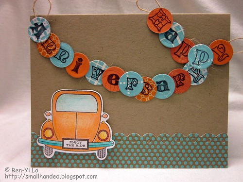
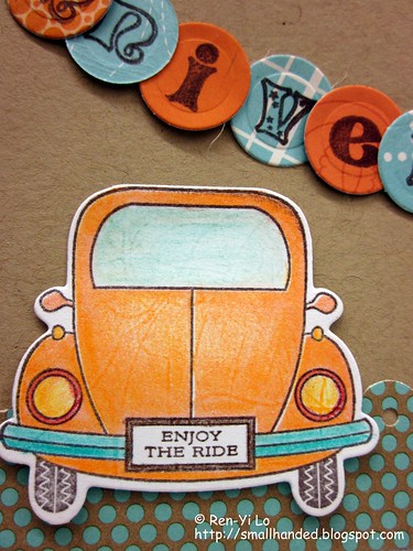
Isn't it cute? Things that struck me were:
So my Pagerize entry took some of those elements that I love, which, incidentally, are also out of my comfort zone. For example, my sentiments are always horizontal. I know - go ahead - call me boring ;)
- Bright, fresh colors - orange and ocean blue/teal
- polka dot paper
- border punches
- the fun sentiment placement (vertical & horizontal)

I tried a twist on creating a banner, but instead of the cute triangles, I opted for little round circles. Here is hoping that there was enough adhesive to adhere them to the twine.

If you haven't made your contribution to the second installment of the Pagerize This challenge, what are you waiting for? You have until October 12, 11:59p CES. You know how it goes -- the more the merrier! :)

Super cute!! I really think I will be stealing the idea for the round banner pieces!
ReplyDeleteOnce again a great take on the Pagerize This Challenge. You do a great job of taking inspiration from the original layout and running with it! So, unlike me! Love it! The card is great and I love the car and license plate!
ReplyDeleteLove it!
I ABSOLULTEY LOVE LOVE LOVE this card!!! I love the orange and teal colors on the Kraft and your title banner is TO DIE FOR!!!! I love the circle idea...I'm stealing that too!!! Thanks for the kind words too! You rocked this challenge!!!
ReplyDeleteAs always, your card is just so cute! I love that banner!
ReplyDeleteGreat alternative banner! Now to get creative myself!
ReplyDeleteGorgeous card!!! Love the car and the banner is great too!!
ReplyDelete