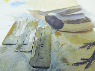
Design Team Member Christy submitted this project for the December Anything Goes Challenge. She said:
Every once in a while, it's good to follow the step by step instructions in the making of a layout. Why? It introduces you to a new technique without the stress and guesswork of what to do with the rest of the page. During November, I took a free class at Miss Arts Paper Crafting School. The class led me through a series of steps to add texture and dimension to my page. It was an enjoyable experience and led to the creation of a page that, while not my usual style, is truly wonderful.
I did not have all of the materials suggested to complete the Layered Layouts class. Rather than purchase the supplies, I made a kit, attempting to match the supply list as much as I could from my stash. By doing so, the page became unique to me, despite the fact that I was following a series of step by step instructions.
Though I may not use everything I learned in the making of this page, I will take parts of the process to incorporate into future pages.
By completing the step by step instructions, I was able to learn the how and the why behind the page's design.I also learned that I love altering pre-made embellishments to meet my needs. I have always loved metal embellishments, for example, but never really liked the way they looked on many of my pages.They seemed to dominate aspects of the page. By altering them, I was able to give them a one-of-a-kind look and better able to blend them into my page's overall design.
The metal tags have so much more character. I even think it's easier to read them now.
This page will become the title page of my wedding album. Though it might not be my usual style, it's very special to me, both because of the amount of work I put into it and because of the end result.
Now it's your turn! Scrap Our Stash is celebrating it's birthday! Share a page or project you've made to help celebrate two wonderful years of using your stash in new ways!


Hello Christy, this layout is stunning and I'm impressed with how you've improvised instead of buying all new supplies ... by doing this you have created a uniquely beautiful layout. The altered embellishments are terrific. Elizabeth
ReplyDeleteI'll ditto what Elizabeth said. Your layout is gorgeous and it was very cool that you did it without buying new stuff!
ReplyDeleteGreat page! I love how you altered the embellishments to make them work for you.
ReplyDeleteChristy, your layout is amazing!! Absolutely gorgeous! I love the way the tags turned out. Wonderful, wonderful job!
ReplyDeleteHow cool is this - love how you were able to alter the metal words. This will make a great first page of your wedding album.
ReplyDeleteThis is stunning, what a fantastic title page for your wedding album. I love how your tags turned out, I love how your whole page turned out!
ReplyDeleteGORGEOUS!!!
ReplyDeleteThank you for the compliments. :)
ReplyDeleteTurned out gorgeous! Love that you were able to find what you needed from your stash.
ReplyDelete