Happy Saturday!
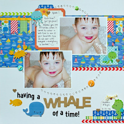
Today we have a fabulous layout to share from Designer Steffanie!
Here's what Steffanie said about her layout:
"I love the overall design of this sketch so I kept my layout basically the same. I did make the central strip wider to accomodate my larger photos. I also made smaller banners mostly because I wanted to show off more of the patterns in this collection. My circle became larger and I chose clear gems to resemble water droplets to tie in with the theme.
List 1: Journal card
List 2: Kraft
List 3: Lined paper (the small tag)"
Here's the challenge:
For more information, click HERE.
Have a great day!


No comments:
Post a Comment